
Kroger B2B Fresh Initiative DASHBOARD
The Problem: Users needed one application to be able to track produce from the day it was picked to the day it was received to the customer. This was called the “Kroger Fresh Initiative.”
At the time users were manually creating reports from existing backend systems. causing frustration on our users due the time and effort to find the right data, and from which system and sometimes the data was ALSO prone to error.
By having a one stop shop to be able to read data for our users fresh initiative, users would be able to make quick, efficient business decisions on produce tracking for the fresh initiative goals.
MY process
Conducted interviews to better understand users day to day and pain points
Conducted usability tests to see if users knew how to use the Power BI Framework efficiently
Conducted on going user interviews for discovery and to gather new user requirements
Conducted a heuristic review on the existing platform to review the UX UI gaps and loop holes for a more intuitive UX
Problem #1
The pilot application had no user experience consistency. Additionally the reports were all seperate URLs, causing challenges with bookmarking, and users forgetting where bookmarks were etc.
This caused overall frustration for users, along with a lack of trust of wanting to use the application overall.

Solution
I collaborated with our Product Engineers to better understand the limitations of the framework. From there I designed a application that had data hierarchy for all reports within the navigation and consistent placement for filtering and data metrics.
INCREASED USABILITY AND BUSINESS REVENUE BY 40%
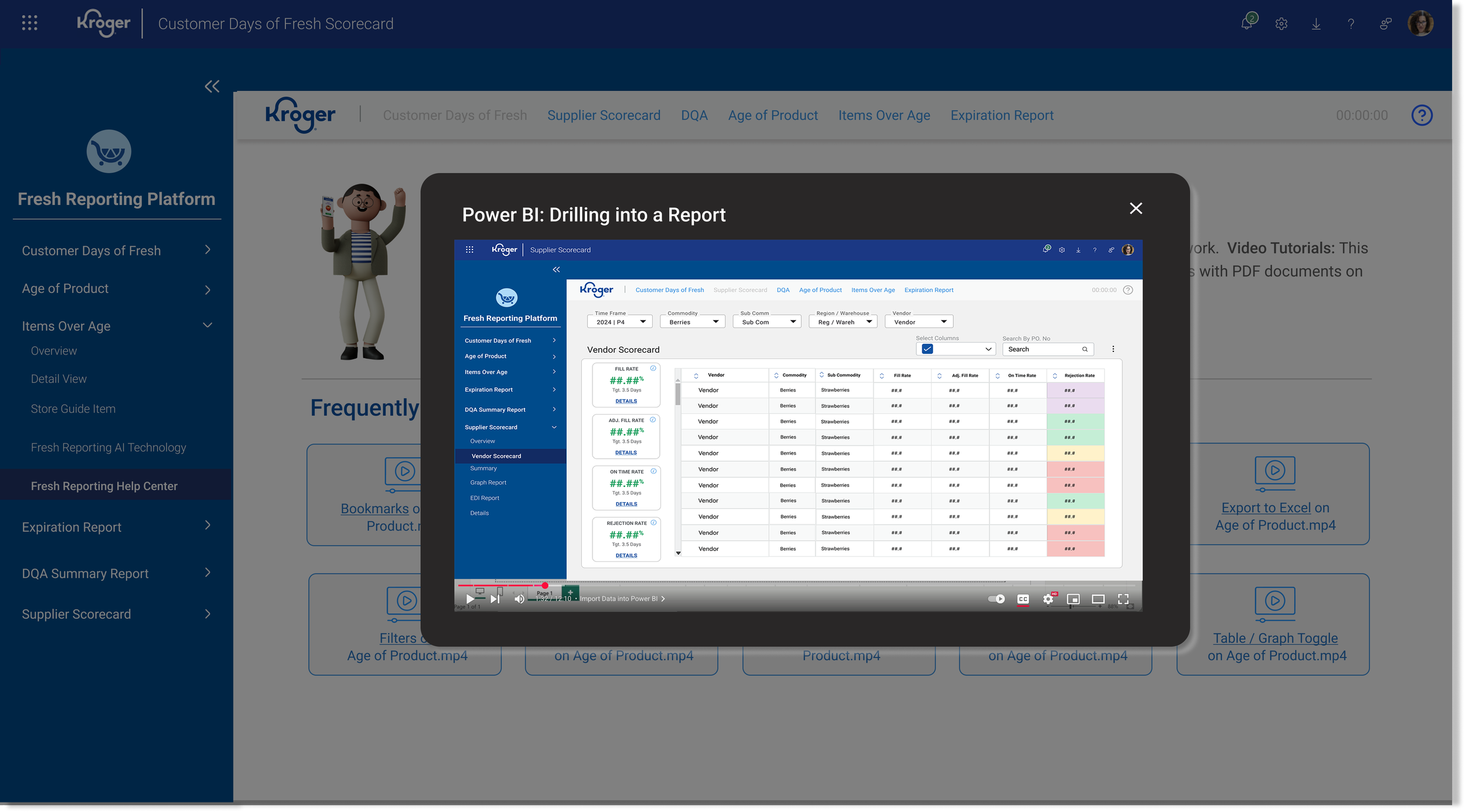
USABility Test
Conducted a usability test to see if users new how to use Microsoft PBI efficiently.
We found that 50% did not know how to use the framework efficiently and sometimes did not want to use it all due to the lack of knowledge on how to use it properly.
RESULTS
I suggested to our team to create short Video Tutorials, in a area called ‘Help Center’ that would help users use the application and avoid frustration or lack of efficiency.
We were able to increase usability by over 25% and users now had an option to use these for training new users!
Users were thrilled with this feature: “These short videos are extremely helpful especially when we are on boarding a new team member.”
Click here for quick walkthrough
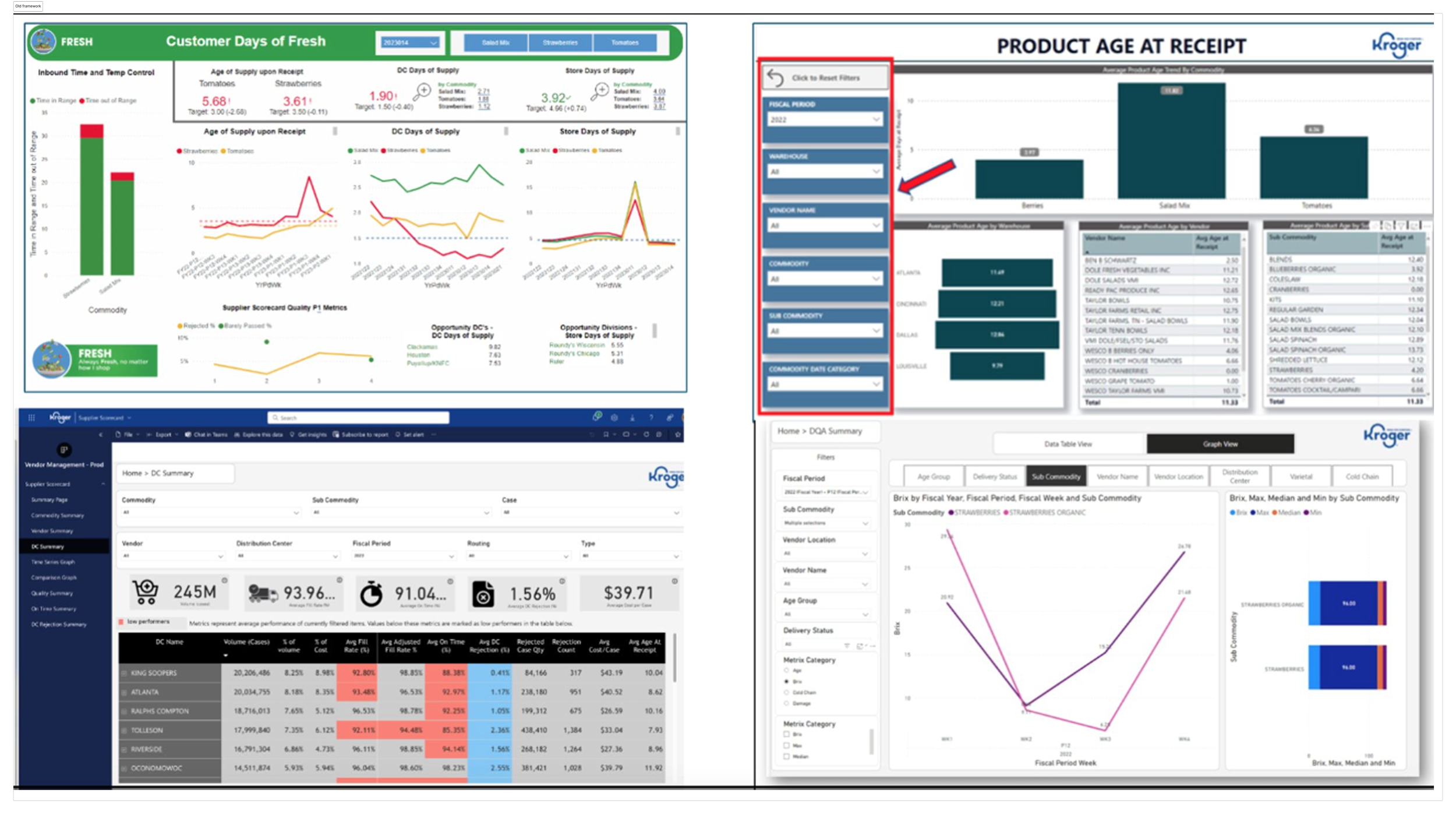
DATA CHALLENGES
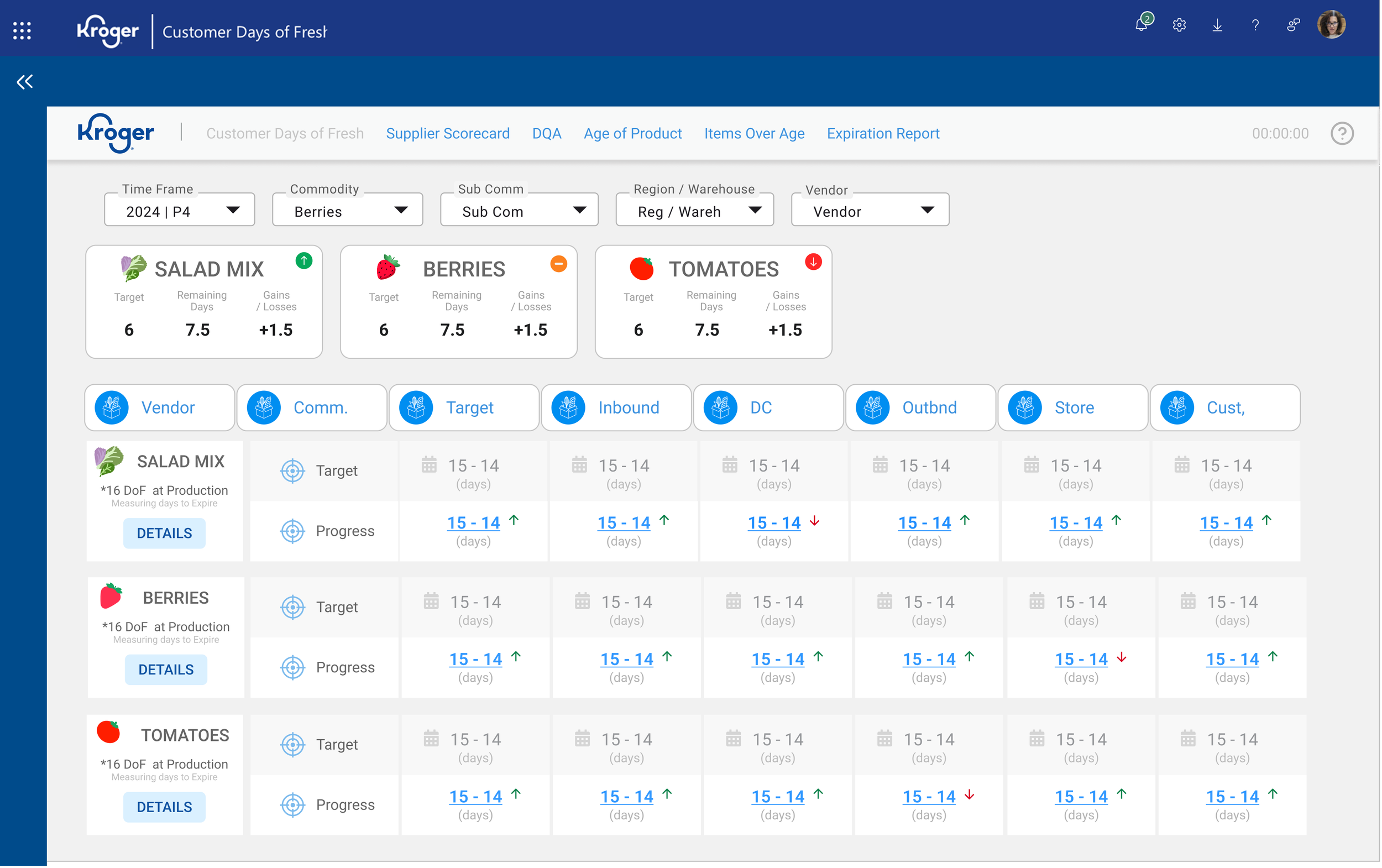
Users needed a way to track the produce lifecycle to better understand where the company was having a challenge to maintain freshness. This data tracker would display the day the customer picked the produce to all the way to when it gets to the store and estimate to customer.
At the time, users were creating a manual report to find this information. Using multiple data sources to find the data and then manually created a graph to display each stage of the lifecycle and present this weekly to vendors and internal teams. Specific stakeholders were working on this to present to our internal B2B groups and vendors.
This caused enormous time and frustration for the users, below is what they were working with.

Solution
Working closely with our engineers and user groups we were able to develop a report that tracked the produce lifecycle from the day it was picked to when it got the customer, in one framework and in one report.
Additionally we were able to highlight areas that were follow off in terms of freshness where users were able to drill in further to find the problem.
By creating a one stop report that provided specific data for each stage of the lifecycle, users where able to now see where the problem lied and make quicker more efficient business design.
Increasing users time and efficiency by 50%
Increasing the fresh initiative goals by 30%.

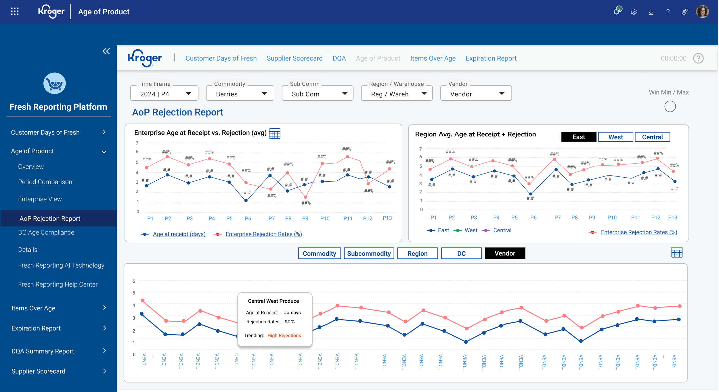
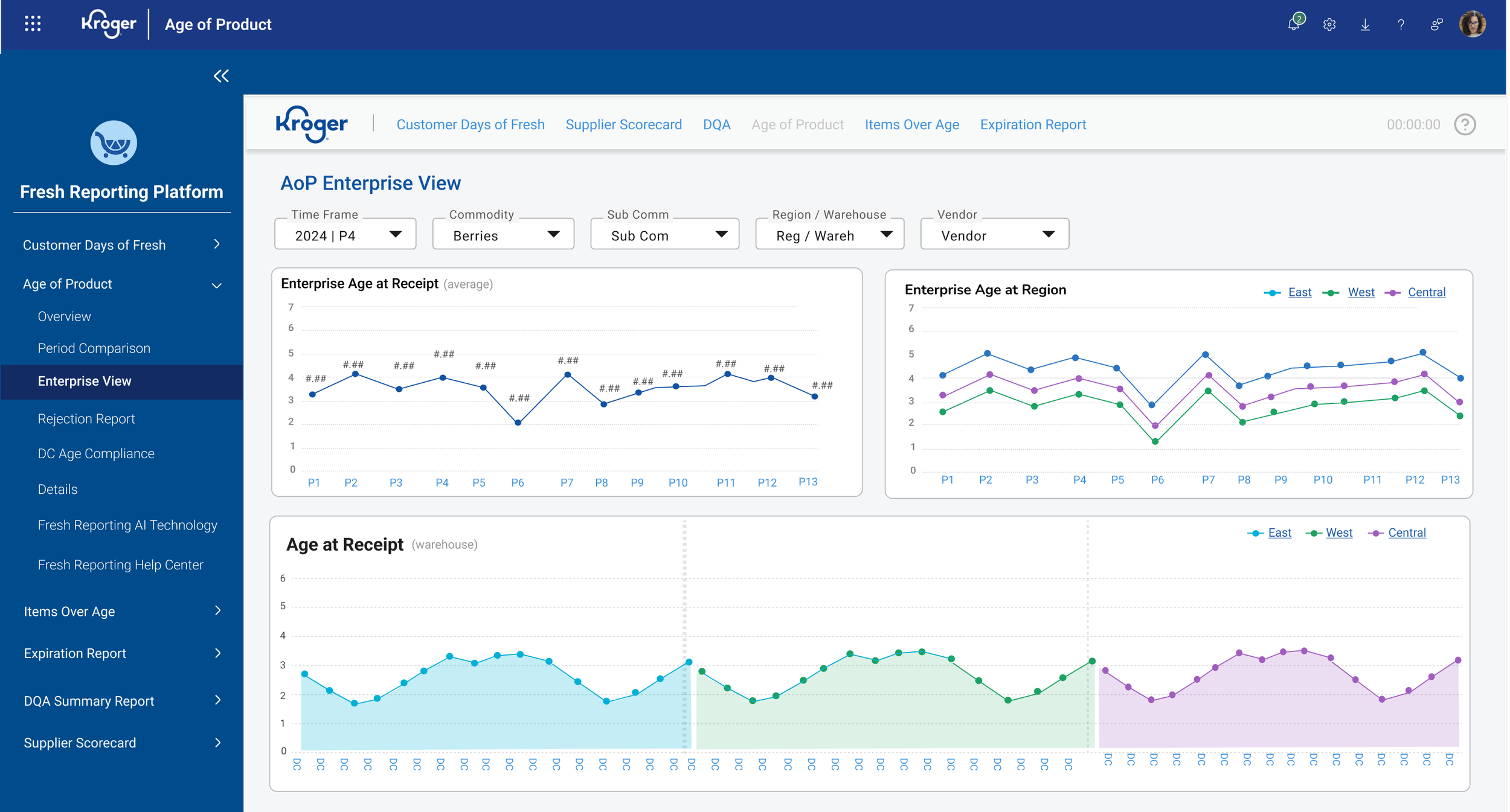
Discovery (Aging Report)
Users were trying to track Enterprise, Regional and DC views on Aging. Again users were trying to find the data from various systems and making their own graphs from their findings to present to internal teams and vendors.
This resulted in frustration on users behalf taking much time and energy out of their other tasks needed for their job.
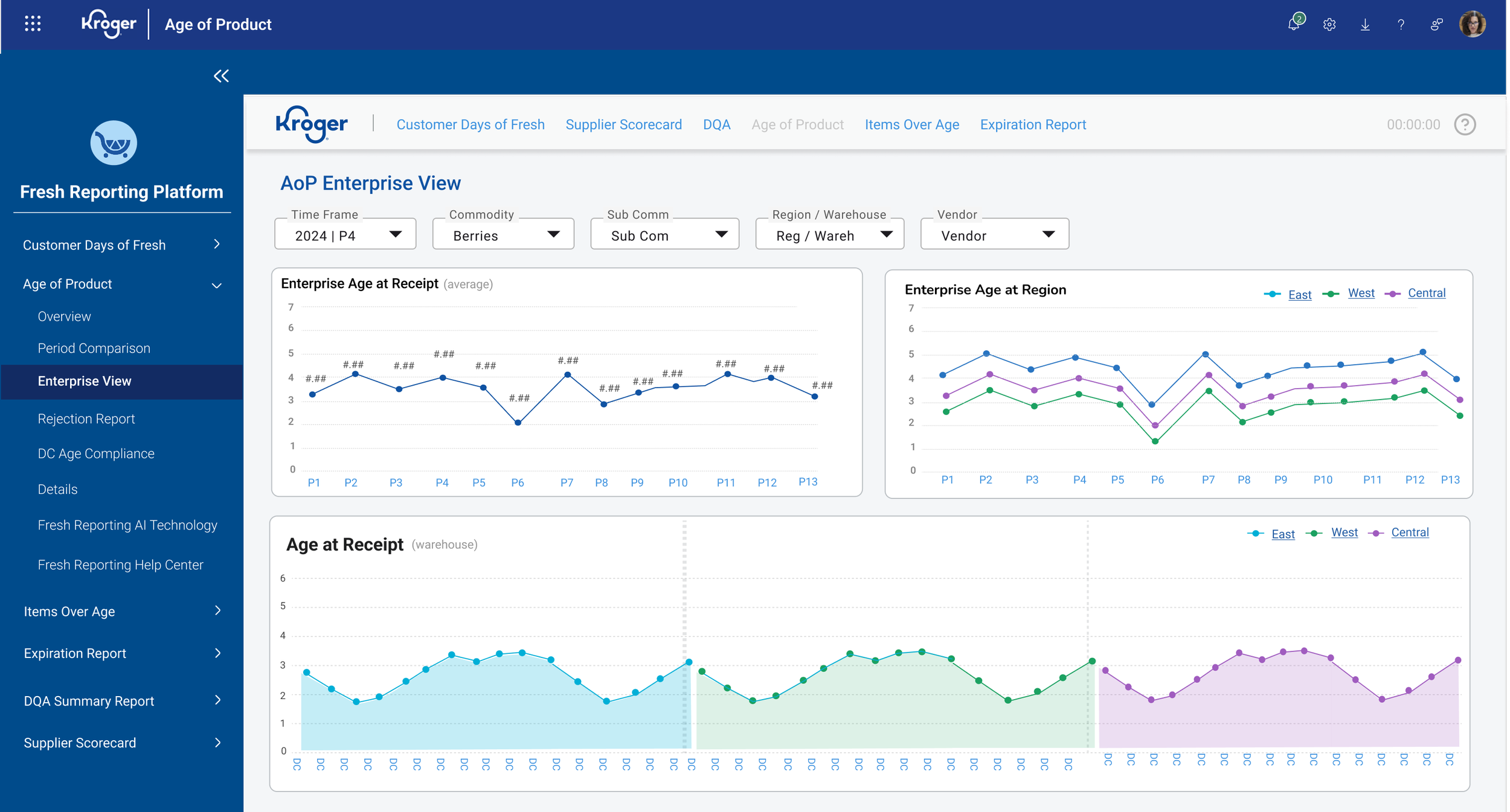
Solution (Aging Report)
Worked with the users to better understand their needs and what they wanted to see. Resulted in 2 reports one Enterprise for Aging and another for rejection rates.
RESULTS: From discovery sessions we ENDED UP WITH 2 MAIN REPORTS that helped users drive specific decisions for aging: 1 TO TRACK AGING OVER ALL AT A ENTERPRISE, REGION AND DC LEVEL AND, two for tRACKING REJECTION RATES.
Increased usability by 15%.
Increase business revenue by over 45%

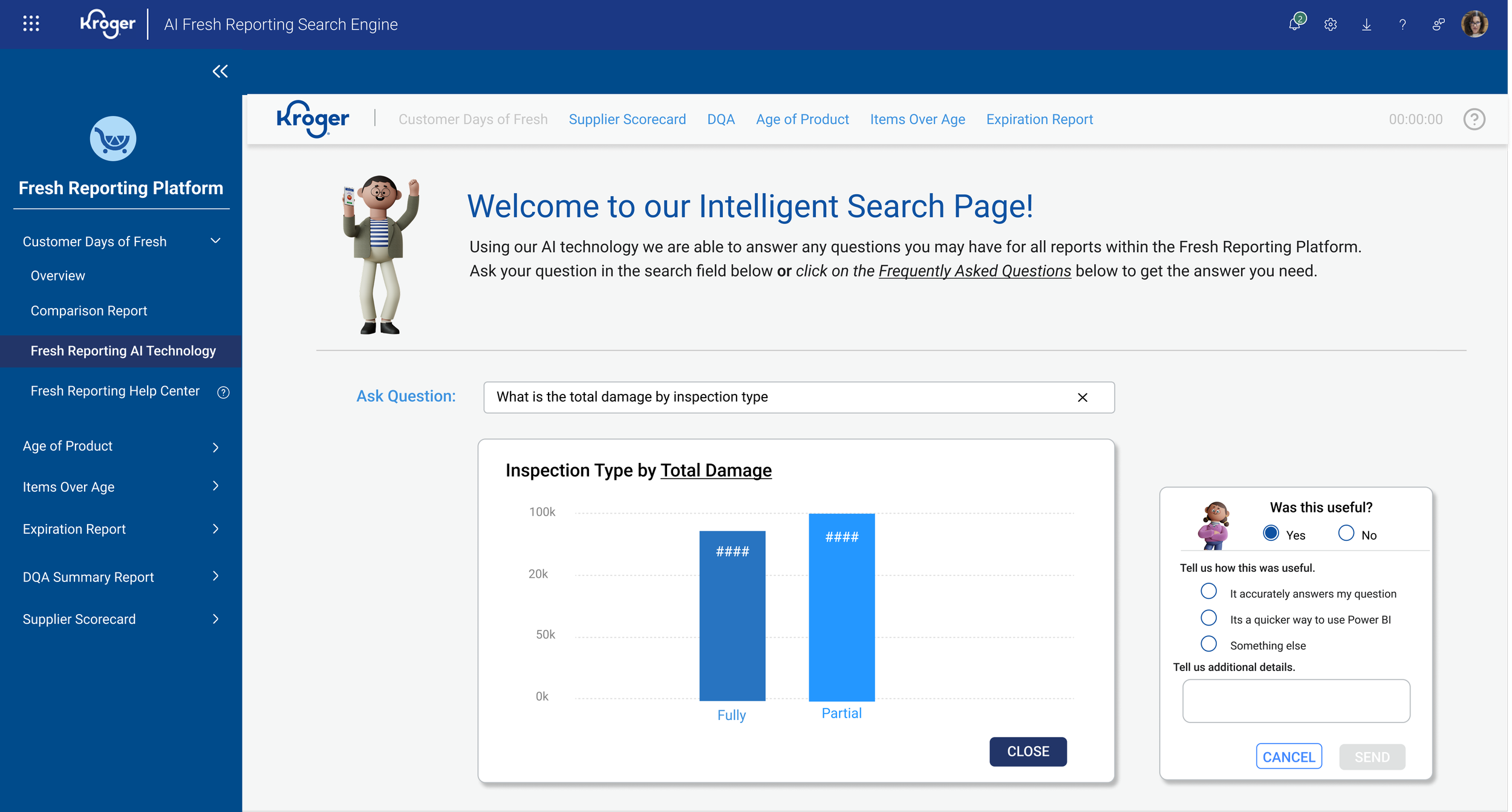
Discovery (AI Co-Pilot)
Our product team conducted usability testing on the copilot feature in Microsoft PBI and realized we could use this to help users with quick accurate answers for their business needs.

Solution
Working together with the product team we created a AI Intelligent Search page that used the copilot feature to help users get quick answers to their questions.
Each parent report had this feature and were able to track frequently asked questions and display them in the UI as well as be able to obtain new questions users had.
Increased users time and efficiency by up to 40%, helping them make accurate and quick business decisions.

Please email me directly to see more of this project: asmith@smithdezign.com.