
WINSTON INSURANCE PORTAL TRANSFORMATION
The Problem
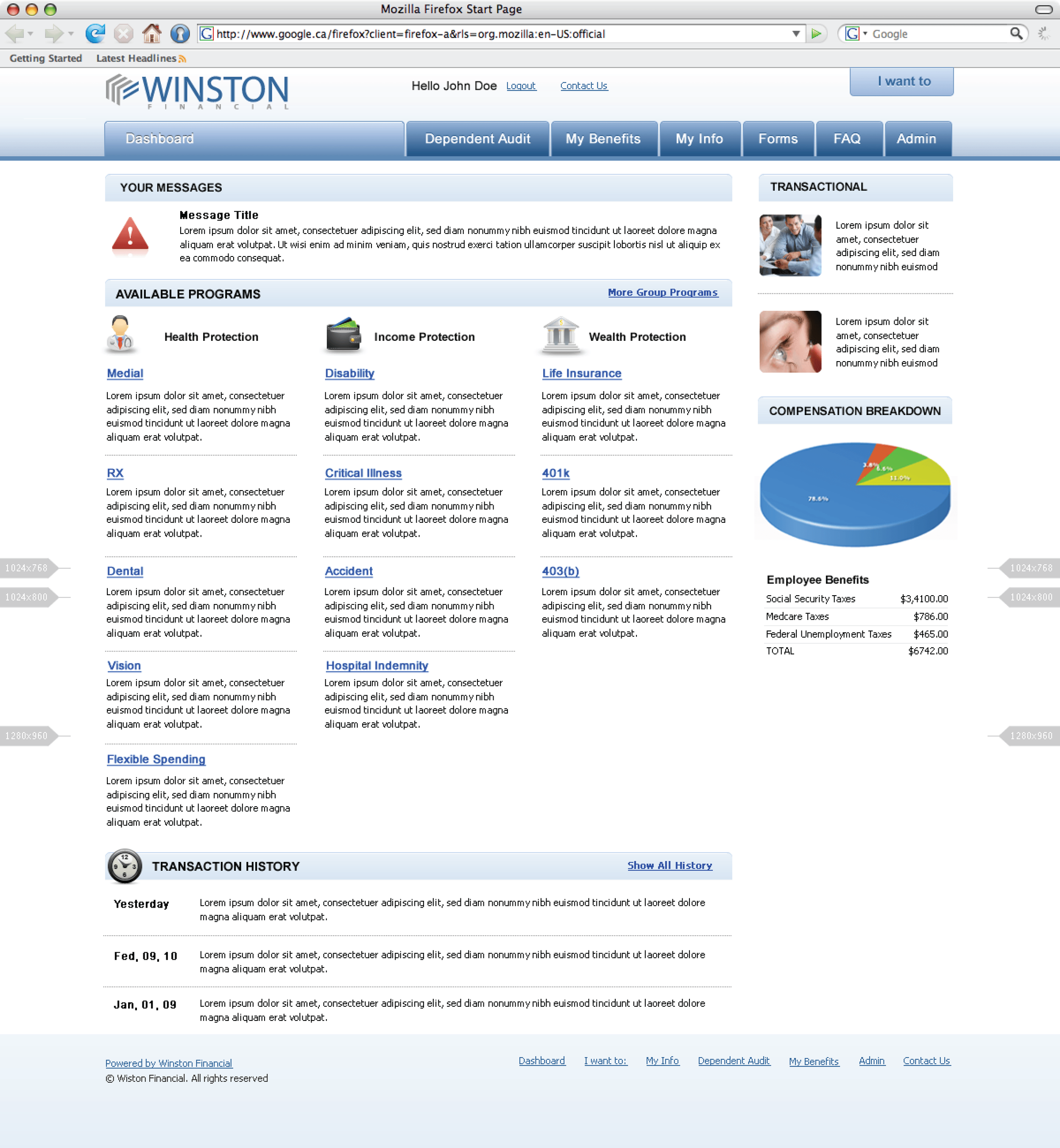
The existing legacy framework was old and outdated.
Overall customers were confused on how to navigate the overall portal system. It lacked an engaging experience and no details on context of areas of the portal users may need help with and much more.

My Process
I conducted a heuristic evaluation over all of the system to better understand the gaps and loop holes.

Continuous Discovery Sessions
Worked with Chief of Sales, Chief Technology Officer and Marketing to establish workflows that were intuitive and better experience for users.
These sessions were on going, with many whiteboard sessions and Low fidelity tests.
Results
Created a more intuitive clear framework that walked users through the insurance portal system in a easy and intuitive way.
Increased sales by 50% and user efficiency by 35%.

Insurance Home
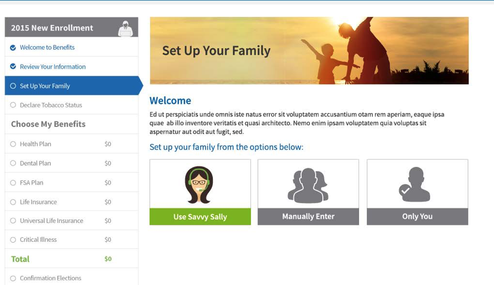
Worked closely with executives and stakeholders to design system that had both the branding an intuitive layout for users. With a animated hero, and using a stepped navigation system users were able to navigate through the system and select insurance they need with ease.

Data Hierarchy
For each step in the journey we worked closely to develop data hierarchy that was clear and concise to users breaking down information from primary, secondary and tertiary categories.

Modal design
Created easy to read modals, with a character I came up with called Savvy Sally to help users through the system. The goal was to keep them engaged and help them through each step of the insurance selection.

Sally walk throughs
Sally modals with tool tips to explain the insurance content to help users with decision making.

Beneficiary view
Overview of user beneficiaries with card view concept. Ability or users to view as a whole and edit each if needed. Using card design and color to differentiate the immediate family vs. important ppl.