
UPS B2B Web Operations EU Transformation

The Problem
The existing framework to manage operations for UPS Opts Managers was old, out dated and a challenge for new users to understand the dated framework. It needed an entire modernization, with a more intuitive experience and new technology following suite of the new mobile application deployed.
The outdated framework was causing extra time and energy on users behalf causing a slew of challenges for their day to day.

MY ROLE
As Lead Designer I was able to do a full redesign of the legacy system and increase users time and efficiency by over 40% with more intuitive and less lag experience.
Additionally with the new features we were able to increase business revenue by over 35%.
Results:
Created a intuitive user experience with design and data that helped users make quick business decisions increasing their time and effort to manage operations by 25%.
Added new features including:Location finder using google maps to help users manage routing
Notification panel to notify users on alerts to help manage operations
2 way messaging service to be able to communicate directly to drivers to help manage challenges during route delivery
Createda more intuitive framework limiting errors and confusion on user experience
Increased business revenue and user efficiency by over 50%.

My Process
First I reviewed the existing legacy system and screens with our Users and Product Owners. Next I developed a sitemap where we made a plan to consolidate screens, build a navigational hierarchy.
Next we developed timelines for each feature / section to provide to upper management on expected deployment timelines.
Observation (Legacy)
Reviewed the existing legacy system with users to understand over all E2E workflows and loopholes. I recorded these calls as a point of reference to ensure I did not mis a thing.
This effort was a combination of observation, and discussions on what they wanted out of the new framework along with having the system accessible for my own heuristic reviews.
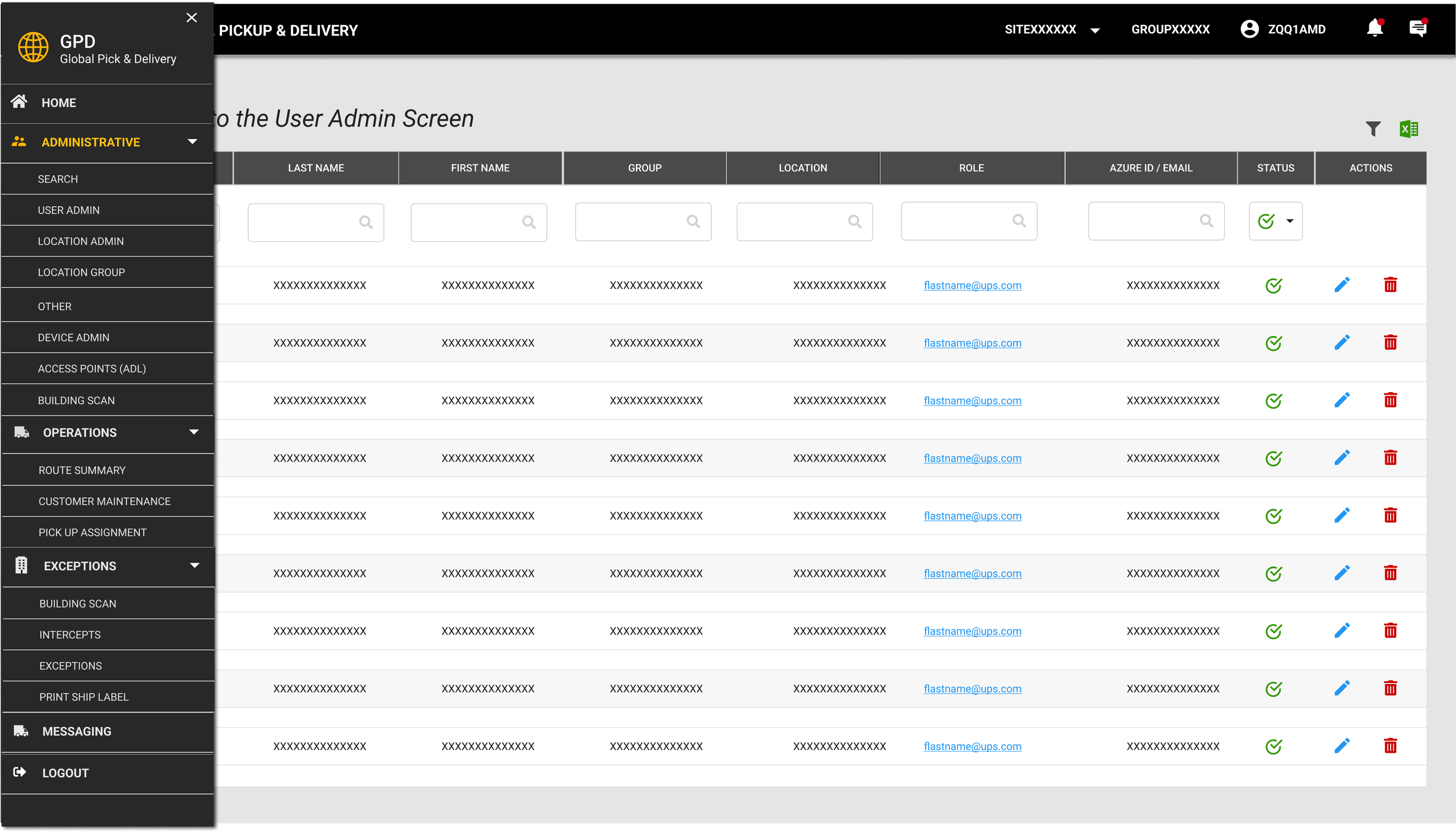
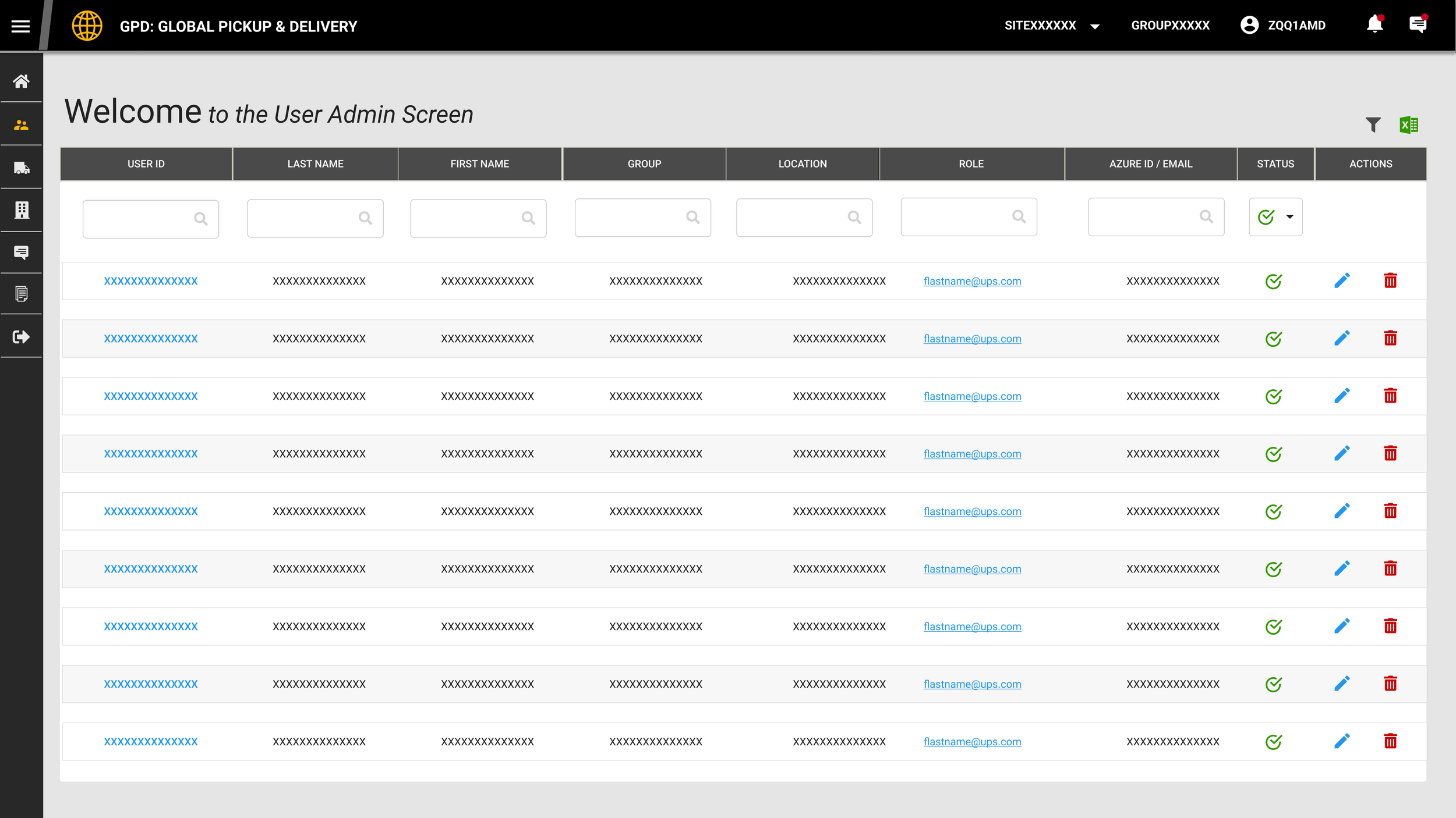
Framework Hierarchy Design
Created a hierarchy for navigation along with a consistent header bar.
QUICK VIEW
Clear User Permissions
Based on admin rights, users would have editing capabilities.
QUICK VIEW
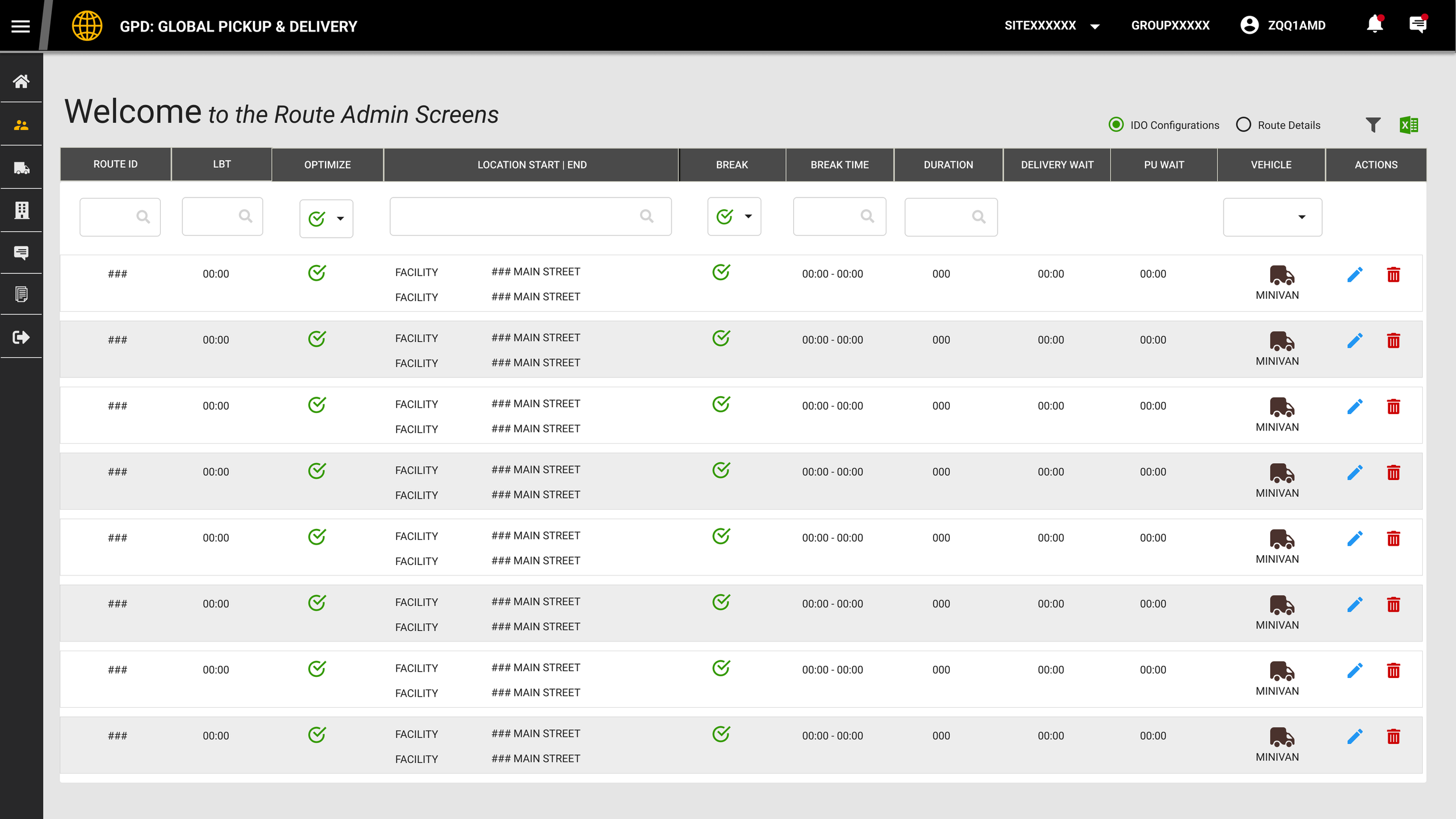
New Routing View
Users were able to manage routes based on role. This feature was nonexistent in the legacy application. Noe users had a clear concise way to view and manage routes for that operation in a clear concise fashion.
QUICK VIEW

Legacy Forms
Legacy forms were long, no data hierarchy, no visualization. Users had to continuously scroll to the bottom to fill out and find CTAs for submittal.
Unless you understood the legacy system you could run into multiple issues and challenges.
Form Resolution
Working with our user groups we established clear forms, with hierarchy to walk users through the data needed to fill out. The new design resulted in a easily identifiable form to easily fill out saving users time and making the experience more efficient.
QUICK VIEW
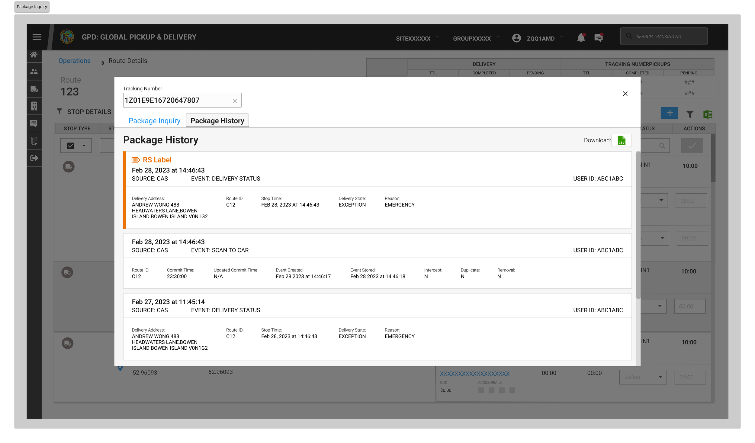
New Forms
Created a more intuitive tab view for both inquiry and history making a clear data visualization along with easy navigation for details, history and route information using tabs.
QUICK VIEW

Notification Panel
Created a new notification panel to allow users to receive immediate notifications to manage operations. This allowed users to create and be notified if there was a emergency or notification they needed to alert drivers or managers on. Helping manage operations daily more efficiently and effectively.
QUICK VIEW
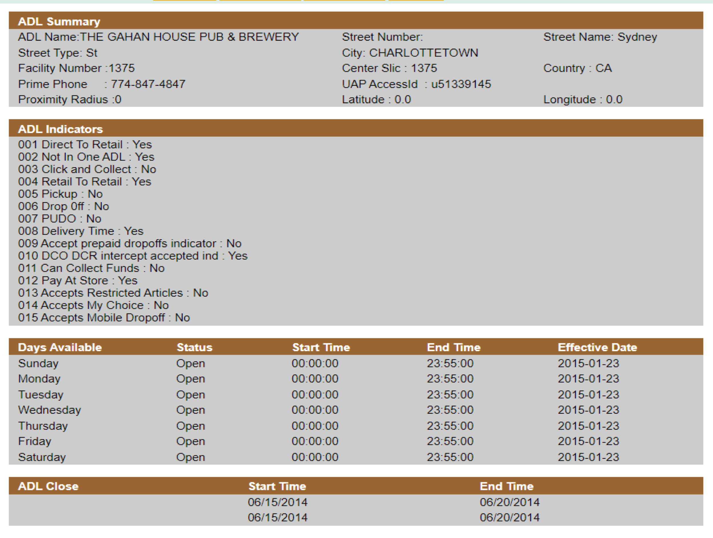
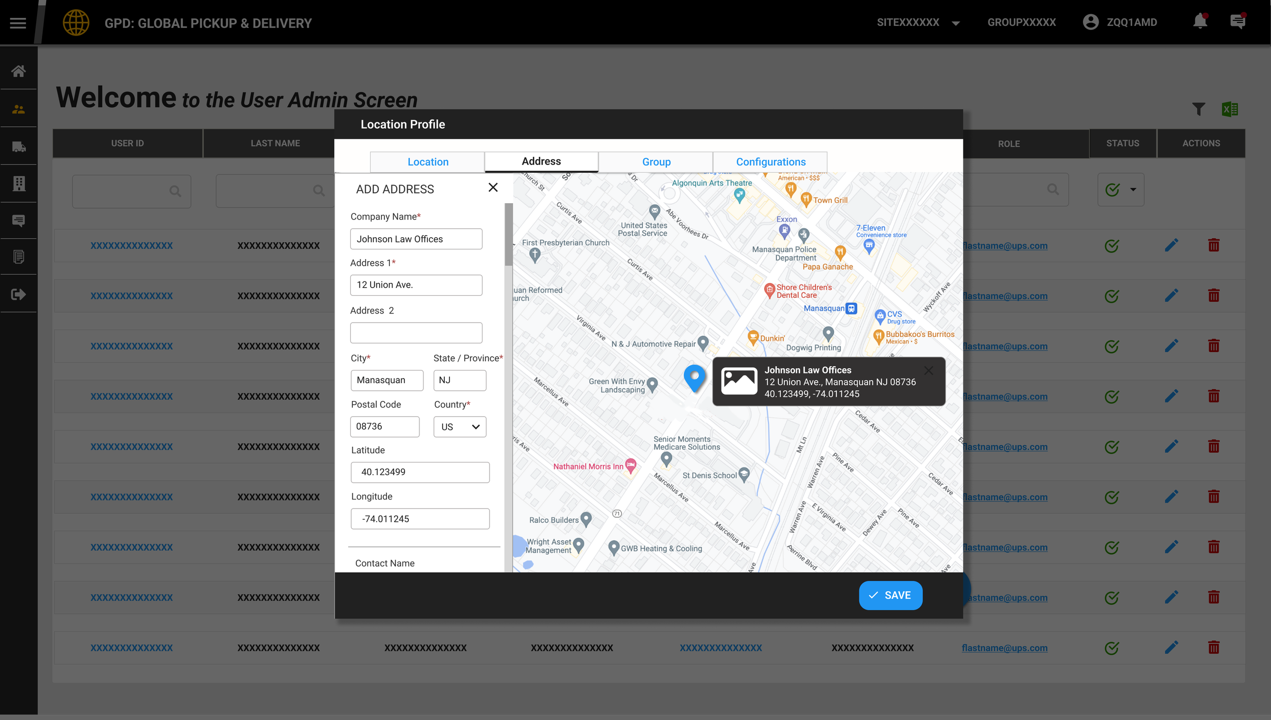
ADL: Access Delivery Location
Access Delivery Location screens were very old and needed a more intuitive experience along with a better, pronounced data hierarchy to help users manage ADLs based on routes
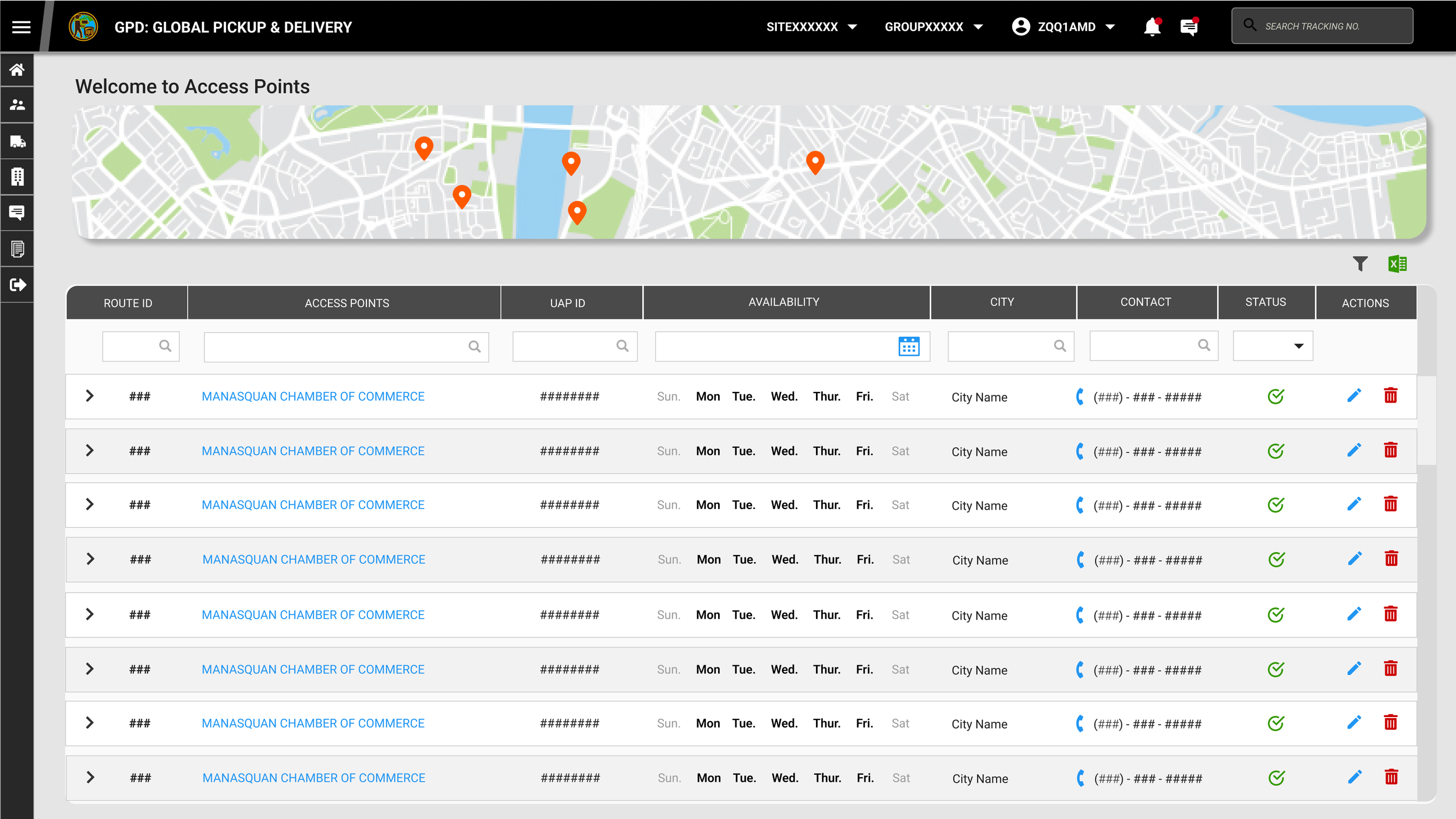
A More Intuitive Experience
Creating an interactive map to manage ADLS based on route.
QUICK VIEW